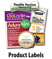
In this blog post, we’re going to look at what makes a good logo design to help you get everything right before you go to print your labels. Here at SixB Labels, using my college degrees in graphic design as well as print engineering, I’ve printed more product labels in nearly four decades than you probably could imagine. In that process, I have learned more than a little about what makes a successful logo design, and what the perfect logo should look like.
 Easily Recognizable Logos
What Are Common Attributes of Productive Logos?
The most productive logos are:
- Easily recognizable
- Memorable to viewers
- Clear and simple
- Classic and timeless
- Versatile, Easy to reproduce
Naturally, the first goal of any good logo design should be to make the logo instantaneously recognizable, as well as to inspire trust, brand loyalty, and admiration for the company’s superiority. As a tool to create brand identity, a logo’s colors, shapes, and fonts need to stand out by looking as different as possible from those of other companies' logos.
Back in the late 1970s, when I was in graphic design school, there was a precept shared amongst the students, that when trying to create a logo:
- If you can’t make it good, make it big.
- If it’s still blah, make it in color.
- If it’s still blah, put a grid behind it.
Now, forty years later, the first two precepts still hold true, and only the third has switched to: put a shape around the letter(s).

Basic Shapes For Logos
What Elements Lead To A Successful Logo Design?
The elements that help to make a logo design successful come down to the effectiveness of a logo’s visual impact, which relies on associations and viewer impressions. For a logo to become associated with a company, and then remain both recognizable and memorable, it must be classic and simple in design. This will allow it to stand the test of time because it will continue to retain its meaning and associations from one generation of viewers to the next.
At this point, the theory of “less is more” really applies. It is possible to convey meaning by distilling concepts and values to a minimized visual formula.
As an ID, a logo is designed not only to sell a product but to reflect the meaning of the company it symbolizes. A ball cap at a big-box retail store might cost six dollars; bearing the logo of a sports organization, it might be priced at three times that amount; and if the logo is that of a luxury brand, the value increases exponentially.
What Makes A Logo Design Good From A Production Perspective?
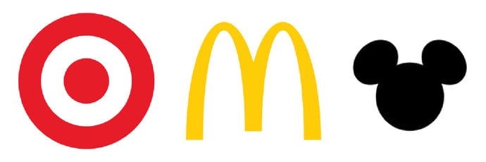
A thriving logo design will have to function well across many types of media and applications. No matter how the logo is to be reproduced — printed, painted, sculpted, embroidered, embossed, displayed on a TV screen, or even branded — for a logo to be reproduced both successfully and with less expense, it needs to use fewer elements and colors rather than more.
Since consumers may see a logo blown up to create an image big enough to cover the side of a building, or reduced to such a degree that the image could fit onto the head of a screw, the logo design still needs to be easily recognizable in both larger and smaller formats. When multiple colors are used, it can only be reduced to a certain size because as it gets smaller, those colors will appear to blur and blend.
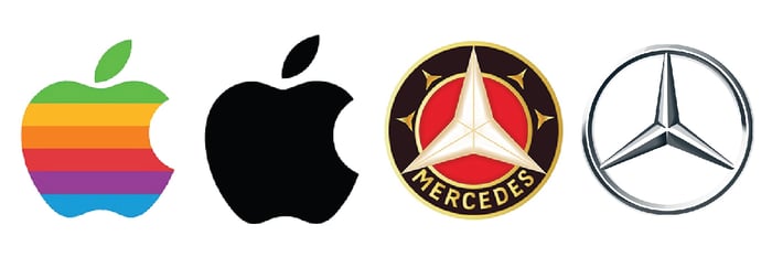
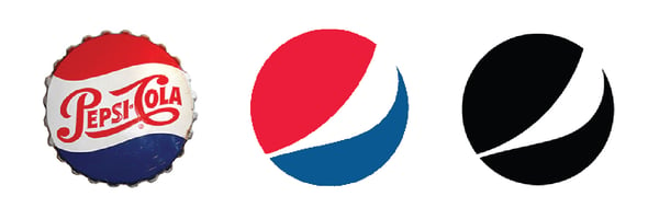
Note how these logo designs have been deliberately simplified over time, from multi-colored to a single bold image with greater impact.
Fashion Logos Simplified Over Time
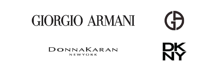
Even the great fashion houses, who have an abundance of fabulous and sometimes extreme design ideas at their disposal, eventually arrive at a monochrome and greatly distilled logo. Before and after examples from two icons of fashion design include the following:
 Updated Fashion Logos
Both designs were originally monochromatic because they started out being embroidered onto the labels inside items. By distilling the designs, they now can be displayed front and center, on the outside of the items. Fewer letters and fewer details make for a design distilled for the greatest impact, and, of course, one that leaves an image that has been rendered easier to use as a branding device on retail goods.
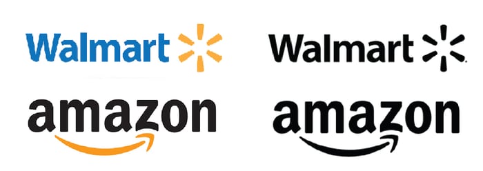
Even global/large companies, such as Walmart and Amazon, where money is no object, have discovered that a monochrome version of their logo can be as effective but at a fraction of the cost of reproduction.
 Monochrome Versions Of Logos
Additionally, something as revered and traditional as our country’s flag has been deliberately made monochrome by the US military on their camouflage uniforms — to reduce the risk for service members by not grabbing extra attention.
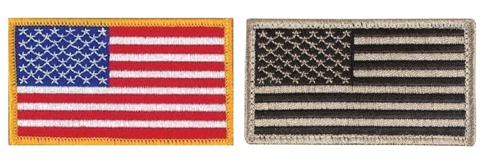 Monochrome Versions Of US Flag
Simplifying and/or Condensing Logo Designs
Another good logo design strategy is to reduce and condense the original design concept to obscurity and then take a step back so that the imagery is still immediately recognizable and intelligible to most viewers.
![]() Simplified Johnson Controls Logo
Simplified Johnson Controls Logo
If pointed out, you will recognize the letters “J” and “C” in the new, stylized version. Having once seen them, you will always remember the association.
 More Applicable Logos
The Final Point
Always remember that no matter what steps you take to simplify any logo — reducing the image from multi-colored to black or monochromatic, or distilling text down to initials or symbols — at the end of the day, it is the actual shape, not the colors, that makes a logo design successful.
Save Time - Email Us Directly With Any Questions: